Empire Group’s brand served them well for decades, but it no longer served others.
WHAT WE DID
Positioning
Naming
Logo Design
Branding
Directional Collateral
Empire Group provides for everybody. Hospitals. School systems. Supermarkets and convenience store chains. You name it. For four decades, they operated as a top wholesale distributor and manufacturer's rep for foodservice equipment. For just about everybody.
An insatiable drive to serve came with an expanded go-to-market strategy, acquiring companies left and right. And therein lies the rub. The legacy Empire Group brand and identity felt empty and wasn’t standing out, capping growth with a fresh batch of customers, employees and investors.
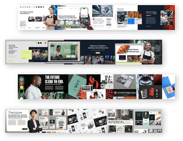
Stylescapes gave a taste of what visual touches would be on the future menu.
When it’s time to dig in, you say, “Yes, chef.”
We got smart quickly, wrapping our hands around day-to-day operations.
Then we conducted interviews and workshops that would inform all the back-of-house work we developed — and would start to inform front-of-house.
After exploring hundreds and pitching dozens, one name rose to the top. It stood out in the industry’s sea of naming sameness. It gave them something to pour equity into, to build trust with new audiences.
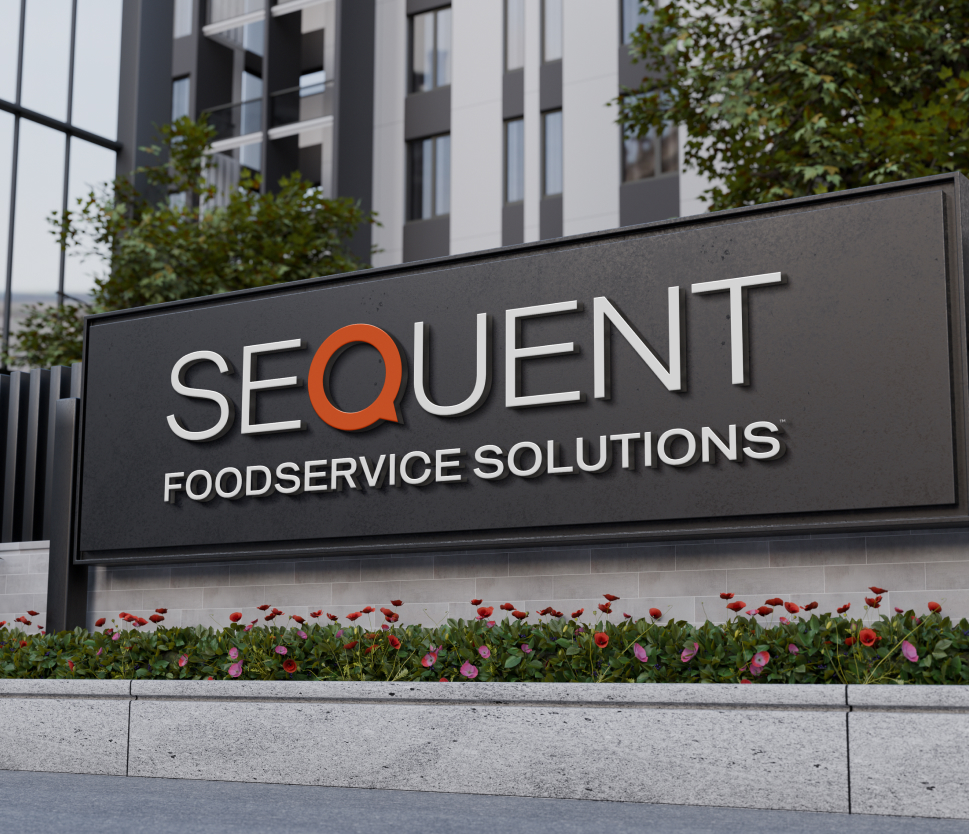
Introducing Sequent Foodservice Solutions
Blending tradition with innovation, the name Sequent embodied a commitment to deliver everything that the foodservice industry needs next at the speed it demands. Sometimes, that’s quite literally the kitchen sink.
The Q in Sequent took the form of a dial seen across so much of the equipment supplied to clients.
Taste-testing visual flavors.
Colors and other brand touches became as bold and confident in the foodservice space as the newly minted Sequent name and the team behind it.
Keeping customers, employees and investors salivating.
The business behind Sequent has been strategically poised to deliver to all their newly acquired audiences. Now their brand is, too.
“
The excitement and energy are high and we are well on our way to achieving the transformation we expect.