CASE STUDY: KICHLER AT THE HOME DEPOT

Interactive Retail at The Home Depot

CASE STUDY

To win at The Home Depot, you better do your homework.

WHAT WE DID

  • Consulting
  • Research
  • Strategy
  • Merchandising Solutions
  • Interactive Retail Display
  • Packaging
Kichler Lighting wanted a national presence at The Home Depot, but the climb was steep. Earning the aisle would require a national merchandising display test, a unique, interactive retail display featuring QR codes, and new packaging concepts tailored to The Home Depot’s audience needs. So Kichler turned to Simon/Myers to chart the path.

Research revealed the unmet needs of the big box shopper. We learned that consumers often sought a more upscale product than currently available. As Kichler crafted the ideal product mix, we paralleled their effort with a captivating merchandising solution that raised the profile of the entire aisle. Finally, packaging was thoroughly redesigned to smooth the customer journey from engagement to transaction.

From research to revelation to result, Kichler is now winning at The Home Depot. Let’s dive into the details.

RESULTS

12

weeks of research end-to-end

500+

customers and pros surveyed

30+

long-form interviews conducted

How research powered up an interactive retail display.

Kichler Lighting suspected there was an undiscovered sweet spot at The Home Depot. Simon/Myers research confirmed it.

We surveyed more than 500 consumers and pros who had shopped The Home Depot for lighting fixtures in the past year, then went even deeper with 30 semi-structured interviews. The research revealed several areas of white space along the purchase journey, both online and in-store. Chief among them: Both consumers and pros wanted a true category leader in the aisle, and they were willing to hit the top edges of their lighting budget to get it. Our strategy paired this “North Star” with numerous insights into how the purchase journey could be improved in-aisle and online, resulting in a win-win-win for shoppers, The Home Depot, and Kichler Lighting.

Part lighting display,
part game night.

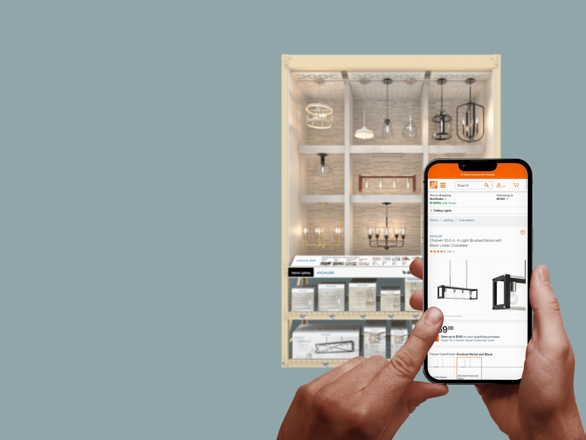
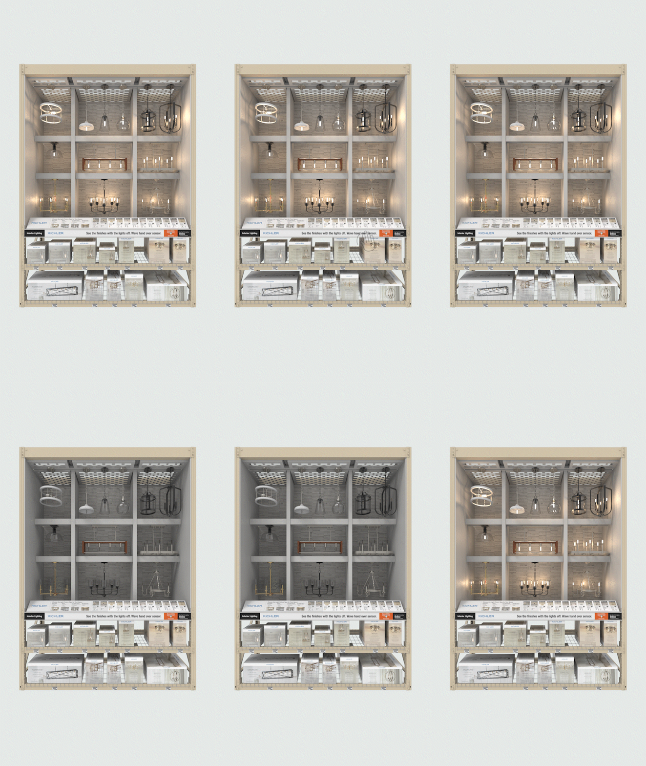
Kichler Lighting knew that their experience at The Home Depot had to rise above the rest of the aisle. Simon/Myers delivered with an Experiential Display Design that was hard to ignore – the first step in the shopper journey.

Not only were key products displayed in on-trend vignettes, but with a wave of the customer’s hand, the lights could be dimmed or brightened.

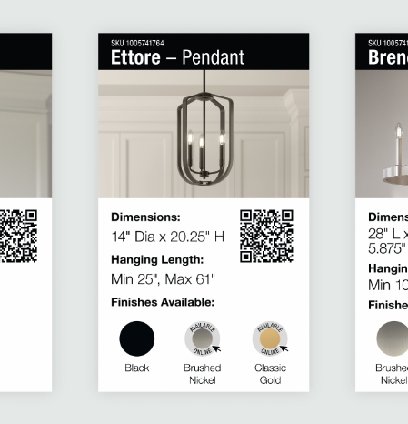
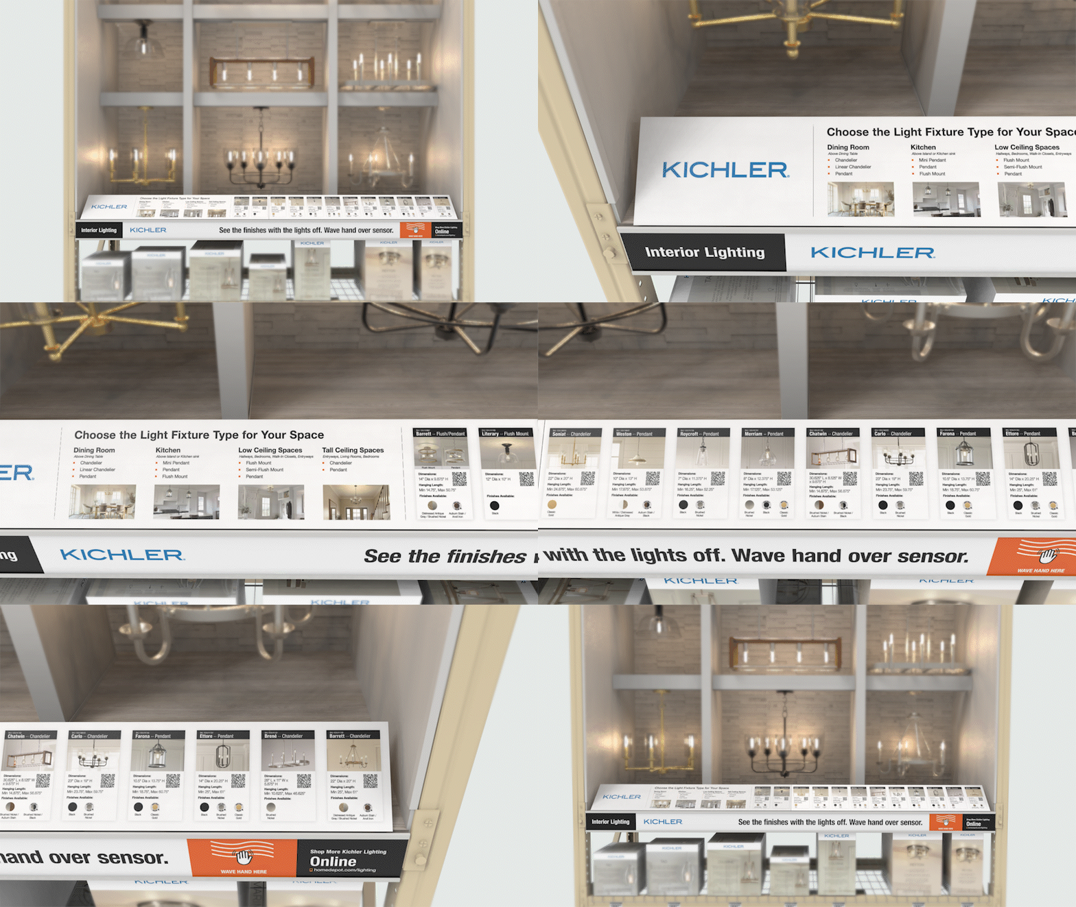
Once the customer was engaged, we made all the details easy to find by featuring QR codes (dramatically re-popularized thanks to COVID-response restaurant menus) that took the user to The Home Depot website.

Part lighting display, part game night.

Kichler Lighting knew that their experience at The Home Depot had to rise above the rest of the aisle. Simon/Myers delivered with an Experiential Display Design that was hard to ignore – the first step in the shopper journey.

Not only were key products displayed in on-trend vignettes, but with a wave of the customer’s hand, the lights could be dimmed or brightened.

Once the customer was engaged, we made all the details easy to find by featuring QR codes (dramatically re-popularized thanks to COVID-response restaurant menus) that took the user to The Home Depot website.

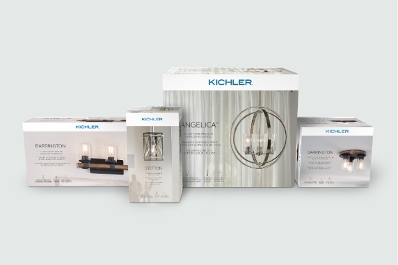
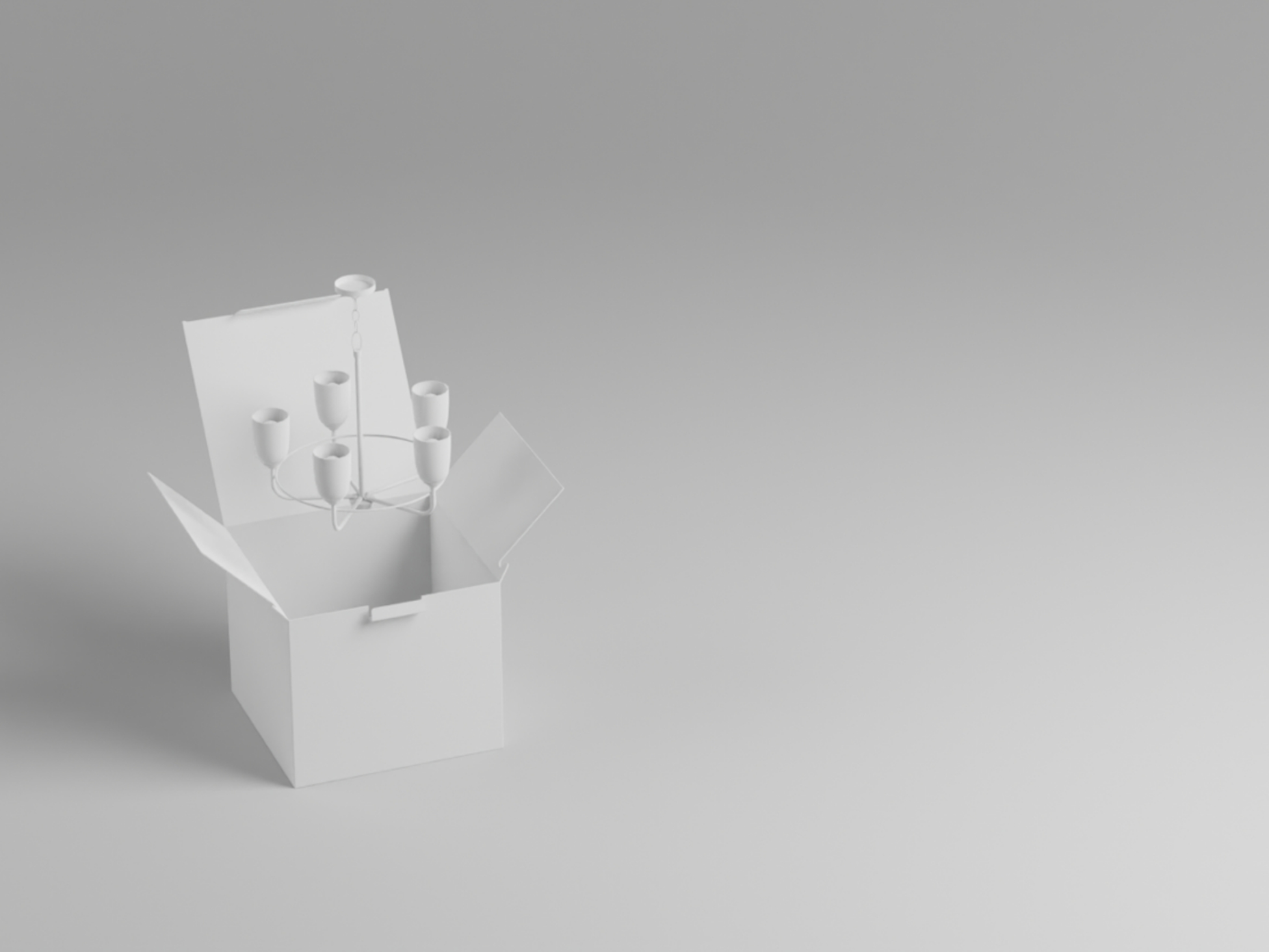
Packaging design that can close the deal.

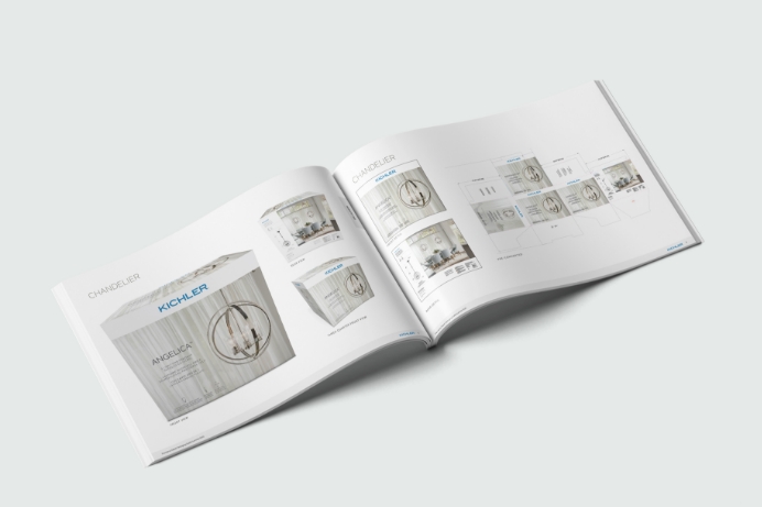
Returning to our research once again, we identified the packaging information and imagery that shoppers respond to most strongly. Then our design team reimagined the Kichler layouts from top to bottom.

Along the way, we charted the newly established photography guidelines and design parameters so that the in-house Kichler team would be able to extend our concepts across all SKUs.

Chicago
444 N. Wells St.,
Suite 204
Chicago, IL 60654
Wheaton
107 N. Hale St.,
Suite 200
Wheaton, IL 60187
Remote
Charlotte, NC
Los Angeles, CA
Colorado Springs, CO
Social
Subscribe
Drop your e-mail below to get news, updates & blog posts.
© 2023 Simon/Myers, LLC.