Case Study: Azek architect outreach

Crafting a Digital Architectural Delight

OVERVIEW

Turning Potential into Performance

WHAT WE DID

  • Research
  • Strategy
  • Wireframe
  • Interface Design
  • Messaging
  • Digital Collateral
AZEK’s TimberTech brand, brimming with innovative composite and PVC decking, needed a web platform to match. The existing site skewed more toward product catalog than creative resource. Architects simply weren’t getting the spark they needed. Functional? Yes. Inspiring? Not so much. Our mission? Transform that digital space into the ultimate playground where creativity meets technical precision. In an industry where the fusion of aesthetics and functionality is table stakes, TimberTech needed a digital overhaul to capture the attention and imagination of its target audience.

We had our work cut out for us.

From Unassuming to Astonishing

We knew spreadsheets of specs wouldn’t cut it. So we crafted a site that was part art gallery, part library, and entirely engaging. We conducted extensive user research to understand architects’ needs. Data told us they craved a blend of visual appeal and detailed information. High-res visuals met intricate specs in a user-friendly interface. This couldn’t just be a site. It needed to be a digital inspiration hub.

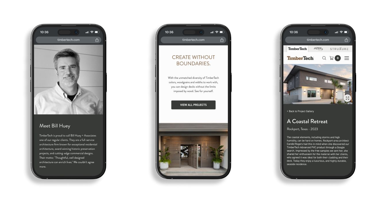
Based on these takeaways, we set out to integrate functionality and beauty. The new design featured high-resolution images of TimberTech’s products in real-world settings, showcasing the aesthetic beauty made possible only through the latest advances in material science. Architects could get all the information they needed in one convenient place. Integrated interactive design tools enabled architects to experiment with different product combinations and the look of their next project.
A Symphony of Collaboration

This was a team effort between our crew and AZEK’s. We brought creativity; they brought precision. The result? A meticulously designed site that’s as intuitive as it is informative.

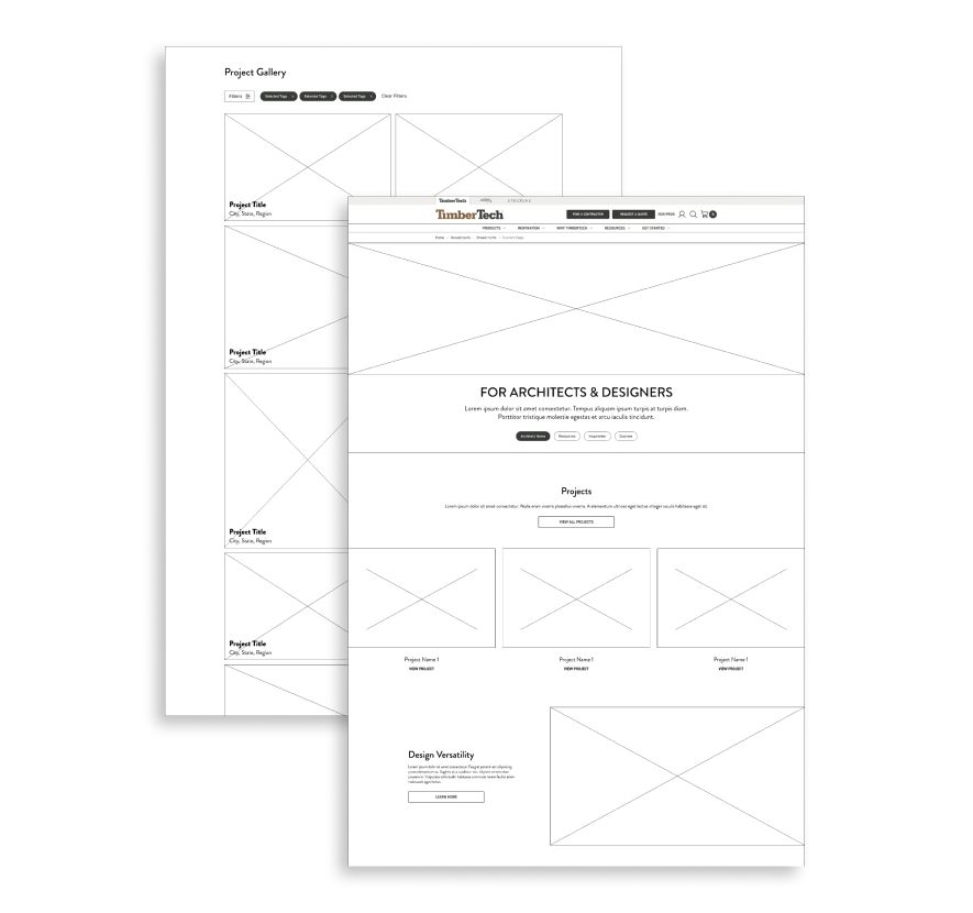
Our collaboration with AZEK involved numerous brainstorming sessions, wireframe reviews, and iterative design processes to fine-tune every aspect. We worked hand-in-hand with AZEK’s internal development team to integrate the new site seamlessly with their existing systems, ensuring a smooth transition with minimal downtime.
Two overlapping wireframe webpage layouts on a white background. The front layout features sections titled "For Architects & Designers," "Projects," and "Design Versatility." The back layout shows a "Project Gallery" section with labeled boxes. Both use placeholder images.

Measures of Success

We weren’t just after clicks. We aimed to captivate architects. It’s why we had the site ready to go for an exclusive American Institute of Architects (AIA) design event in Chicago. The site’s intuitive design, comprehensive resources, and seamless blend of inspiration and technical detail served as a launching point for critical sales conversations — and for a direct positive impact on AZEK’s bottom line.

A Digital Wonderland

Architects now flock to TimberTech’s new site not just to see product, but to experience it. And what do they experience? A place where their design dreams meet the concrete details needed to bring them to life.

By focusing on the needs of this unique audience — and by leveraging the strengths of our team and AZEK’s — we created a digital platform that stands out in the crowded field of building products.
Three smartphones display different pages of a website. The first phone presents a profile of Bill Huey, the second one has text about creating without boundaries and a button labeled "View All Projects." The third shows a modern, coastal house labeled "A Coastal Retreat.
Chicago
444 N. Wells St.,
Suite 204
Chicago, IL 60654
Wheaton
107 N. Hale St.,
Suite 200
Wheaton, IL 60187
Remote
Charlotte, NC
Los Angeles, CA
Colorado Springs, CO
Social
Subscribe
Drop your e-mail below to get news, updates & blog posts.
© 2023 Simon/Myers, LLC.