Power is in the Hands of the Shopper


Retail marketing solutions, meet retail digital marketing
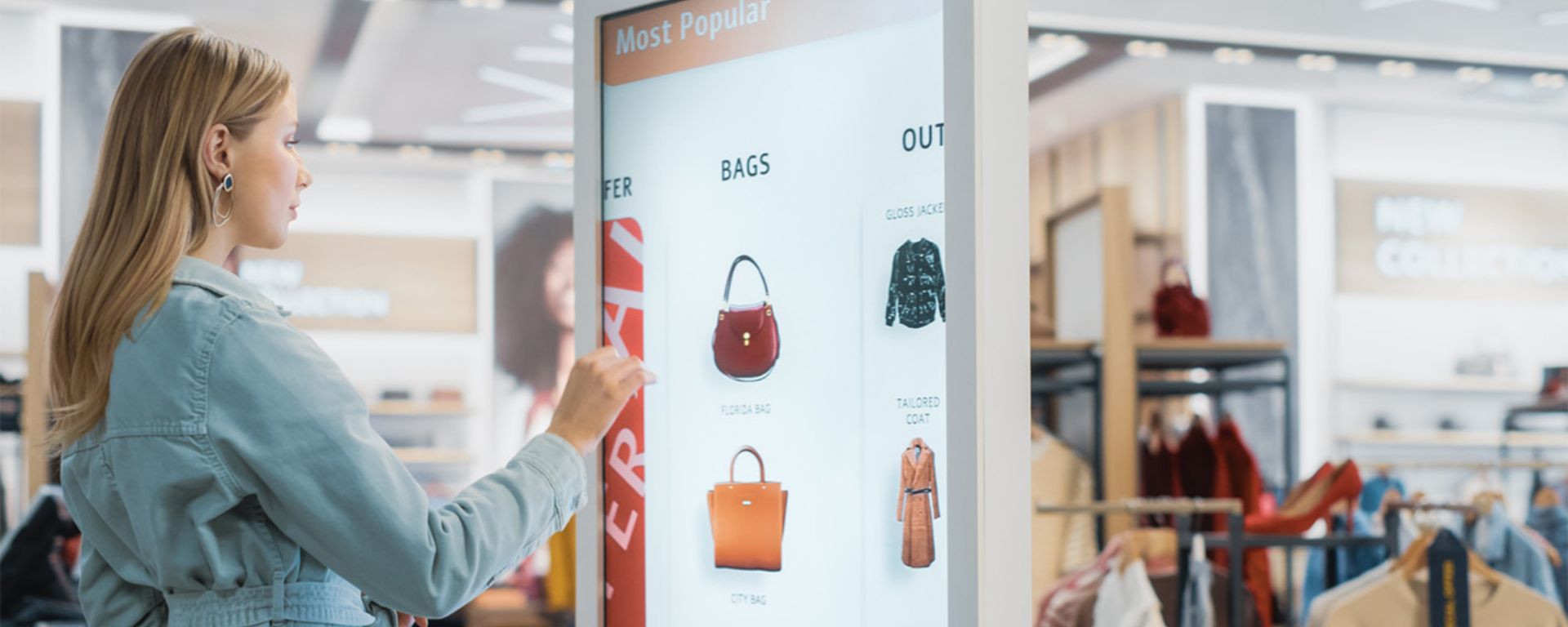
For years, hybrid retail marketing — an integrated physical and digital experience — was seen as the gold standard for differentiating a product and getting shoppers to open their wallets at bricks-and-mortar retail. I can hear it now:
“Brands have so much to say, if they could only get their content in front of shoppers, we just know it will prompt a purchase!”
Hmmm… Outside of a few notable exceptions, why did so few brands or retailers get it right?
If you are a channel marketer, mass marketing retailer, or a display producer, you understand that in years past, it was extraordinarily hard to execute digital solutions at scale. (Anyone that implies otherwise hasn’t been in the trenches.) From a tech and infrastructure perspective, there was bad Wi-Fi in stores, and power outlets seldom available where you need them. Not to mention, straight-up hardware failures.
Physically implementing content updates? Damn near impossible. Store employees turning down or turning off the unit due to the audio factor was a common occurrence as well. And don’t get me started on the negative impression of seeing blank screens.
Brands served up content on a push strategy that didn’t, or couldn’t, consider what the shopper needed. Largely since, brands and retailers weren’t able to customize the journey for each user. Much of the content was fluff. It didn’t address the consideration drivers that someone experiences while in the “final foot.” Showing me a sizzle video of how your washing machine’s design was inspired by water isn’t the type of content I need when I’m choosing between models.
Shopper marketing means shopper respect
Even with the right content, shoppers were reluctant to engage in a digital experience while standing in an aisle. There were issues of cleanliness, privacy, and personal space. What seemed like a no-brainer engagement that we just knew would help sell product, went underutilized — often to get pulled only months after installation.
Then, in 2007, shoppers got a new toy from Apple: the smartphone. For all those keeping track, IBM did release a precursor to the smartphone in 1994, ironically called Simon. Let’s just say it didn’t have the same impact as the iPhone did.
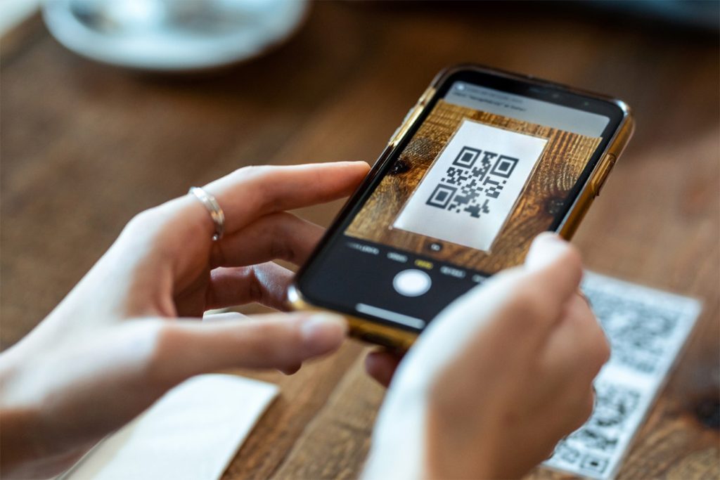
Over the years, SMS solutions, QR codes, listing URL addresses on displays… they were all thrown into the mix. Brands got smarter about understanding the user journey that happens both offline and online. We used digital research tools (many of which are disappearing due to privacy laws) to better understand the path folks took when deciding on the product that is right for them.
So we got smarter. We tried whatever we could to increase usage, but it was still difficult to serve up the right content at the right time. In addition, engagement rates were still relatively low.
Until now.

High adoption rates: QR codes are one step to the next level
Over the last few years, we were all a bit surprised when QR codes replaced the menu at our local restaurant. And now? We use them without thinking twice. In terms of digital adoption, the pandemic accelerated this change, eradicating one significant barrier to effective omnichannel merchandising at retail. Shoppability research conducted recently at S/M has shown 100% familiarity with and extremely high adoption rates of this rediscovered technology.
So, what are we going to do with this new power? Plastering QR codes on every inch of every graphic like wallpaper would neutralize the ability to help folks make their purchase decisions quickly and decisively. Good fundamental research is the key, as the path to purchase and consideration drivers in the final foot are more important than ever.
When S/M analyzed the purchase process for lighting fixtures on behalf of client Kichler at The Home Depot, user research revealed what information needed to live on the display and the new packaging. Equally importantly, what kind of information would the shopper like to find with their smartphone in order to make a final decision? Curating the information funnel allowed for a clean visual experience with a clear information hierarchy. But one with depth, providing opportunities to dive as deep as the user desired.
Next-level applications are opportunities like augmented reality and virtual reality. Check out how IKEA is bringing the decision to your home via their app, IKEA Place. Once clunky and awkward, these experiences continue to be refined. For even more forward-leaning examples, check out this article by S/M Creative Director, Experiential, Kathleen Carron. Like I said, the team passed me up long ago.
Let’s respect the shopper's time. Let’s respect their intelligence. Let’s do our jobs right and provide the information they need when they need it. The key is good data and insights that lead to a targeted retail strategy. If you’d like to infuse this type of thinking into your next initiative, we should talk.

Subscribe for
more Slant
This site is protected by reCAPTCHA and the Google Privacy Policy and Terms of Service apply.


